API Demos
+ Bootstrap + JSON
Bootstrap is a framework that lets us build websites fast. This demo shows how remote JSON can be used to fetch element data for dynamic page content generation. This example uses a static JSON file for convenience, but an API responding with JSON data will achieve the same result.
Sidebars Navbars Grid Album Cover Carousel Start Template Cheatsheet
Bootstrap + React
Bootstrap and React can be used together in a few ways. For the course, we will use the NPM package
npm install bootstrap
{/* main.jsx */}
import 'bootstrap/dist/css/bootstrap.min.css';
import 'bootstrap/dist/js/bootstrap.bundle.min.js';
Navbar

{/* navbar */}
<nav className="navbar navbar-expand-lg navbar-dark bg-dark">
    <div className="container">
        <a className="navbar-brand" href="#">
            React + Bootstrap Demo
        </a>

        {/* Button to expand menu on smaller screens */}
        <button
            className="navbar-toggler"
            type="button"
            data-bs-toggle="collapse"
            data-bs-target="#navMenu"
        >
        <span className="navbar-toggler-icon"></span>
        </button>

        <div className="collapse navbar-collapse" id="navMenu">
            <ul className="navbar-nav ms-auto">
                <li className="nav-item">
                    <a className="nav-link active" href="#">
                        Home
                    </a>
                </li>

                <li className="nav-item">
                    <a className="nav-link" href="#">
                        Features
                    </a>
                </li>

                <li className="nav-item">
                    <a className="nav-link" href="#">
                        Contact
                    </a>
                </li>
            </ul>
        </div>
    </div>
</nav>
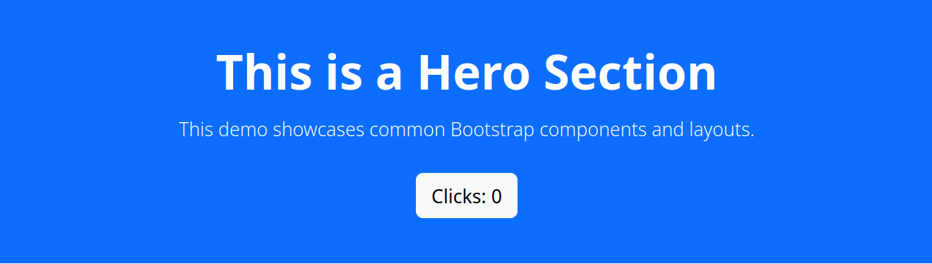
Hero Section
{/* Hero section */}
<section className="bg-primary text-white text-center py-5">
    <div className="container">
        <h1 className="display-4 fw-bold">
            This is a Hero Section
        </h1>

        <p className="lead mt-3">
            This demo showcases common Bootstrap components and layouts.
        </p>

        <button
            className="btn btn-light btn-lg mt-3"
            onClick={() => setClicks(clicks + 1)}
        >
            Clicks: {clicks}
        </button>
    </div>
</section>
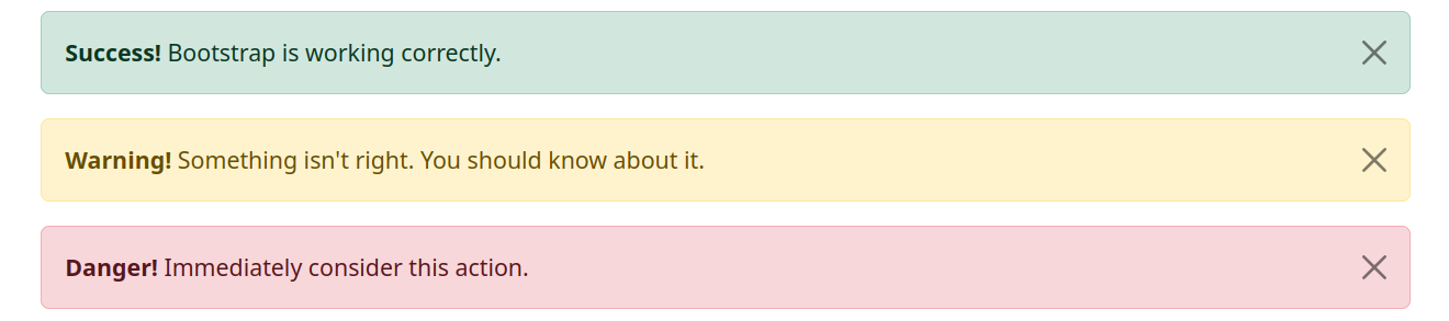
Alerts
{/* Alert */}
<div className="container mt-4">

    {/* Success alert */}
    <div className="alert alert-success alert-dismissible fade show">
        <strong>Success!</strong> Bootstrap is working correctly.
        <button
            type="button"
            className="btn-close"
            data-bs-dismiss="alert"
        ></button>
    </div>

    {/* Warning alert */}
    <div className="alert alert-warning alert-dismissible fade show">
        <strong>Warning!</strong> Something isn't right. You should know about it.
        <button
            type="button"
            className="btn-close"
            data-bs-dismiss="alert"
        ></button>
    </div>

    {/* Danger alert */}
    <div className="alert alert-danger alert-dismissible fade show">
        <strong>Danger!</strong> Immediately consider this action.
        <button
            type="button"
            className="btn-close"
            data-bs-dismiss="alert"
        ></button>
    </div>
</div<
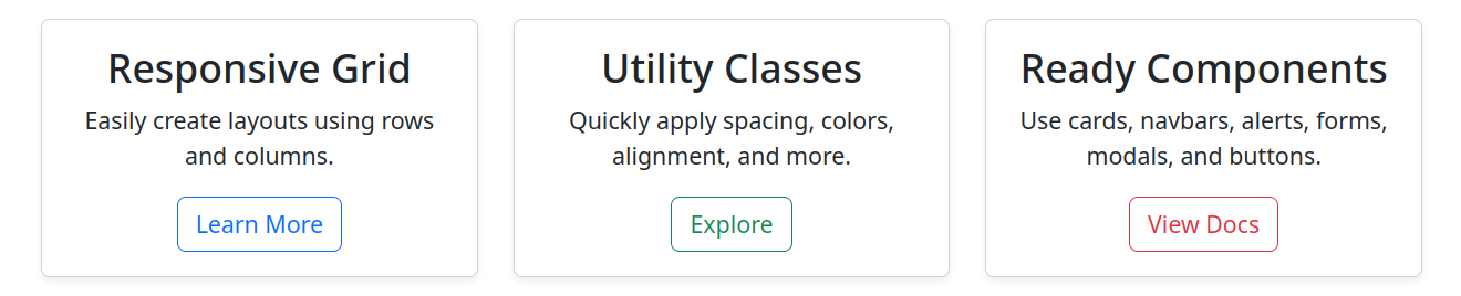
Card Section
{/* Cards */}
<section className="container py-5">
    <h2 className="text-center mb-5">Bootstrap Features</h2>

    <div className="row g-4">
        <div className="col-md-4">
            <div className="card h-100 shadow-sm">
                <div className="card-body text-center">
                    <h3 className="card-title">Responsive Grid</h3>

                    <p className="card-text">
                        Easily create layouts using rows and columns.
                    </p>

                    {/* Button that alternates between 2 button styles on click */}
                    <button className="btn btn-outline-primary" onClick={(e) => {
                            const btn = e.target;
                            console.log(btn);
                            if (btn.classList.contains("btn-outline-primary")) {
                                btn.classList.replace("btn-outline-primary", "btn-primary");
                            }
                            else {
                                btn.classList.replace("btn-primary", "btn-outline-primary");
                            }
                        }}>
                        Learn More
                    </button>
                </div>
            </div>
        </div>

        <div className="col-md-4">
            <div className="card h-100 shadow-sm">
                <div className="card-body text-center">
                    <h3 className="card-title">Utility Classes</h3>

                    <p className="card-text">
                        Quickly apply spacing, colors, alignment, and more.
                    </p>

                    <button className="btn btn-outline-success">
                        Explore
                    </button>
                </div>
            </div>
        </div>

        <div className="col-md-4">
            <div className="card h-100 shadow-sm">
                <div className="card-body text-center">
                    <h3 className="card-title">Ready Components</h3>

                    <p className="card-text">
                        Use cards, navbars, alerts, forms, modals, and buttons.
                    </p>

                    <button className="btn btn-outline-danger">
                        View Docs
                    </button>
                </div>
            </div>
        </div>
    </div>
</section>
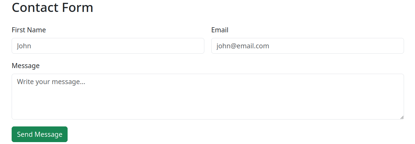
Form
{/* Form */}
<section className="container py-5">
    <h2 className="mb-4">Contact Form</h2>

    <form className="row g-3">
        <div className="col-md-6">
            <label className="form-label">First Name</label>

            <input
                type="text"
                className="form-control"
                name="firstName"
                value={formData.firstName}
                onChange={handleChange}
                placeholder="John"
            />
        </div>

        <div className="col-md-6">
            <label className="form-label">Email</label>

            <input
                type="email"
                className="form-control"
                name="email"
                value={formData.email}
                onChange={handleChange}
                placeholder="john@email.com"
            />
        </div>

        <div className="col-12">
            <label className="form-label">Message</label>

            <textarea
                className="form-control"
                rows="4"
                name="message"
                value={formData.message}
                onChange={handleChange}
                placeholder="Write your message..."
            ></textarea>
        </div>

        <div className="col-12">
            <button
                type="button"
                className="btn btn-success"
                data-bs-toggle="modal"
                data-bs-target="#messageModal"
            >
                Send Message
            </button>
        </div>
    </form>
</section>
Modal
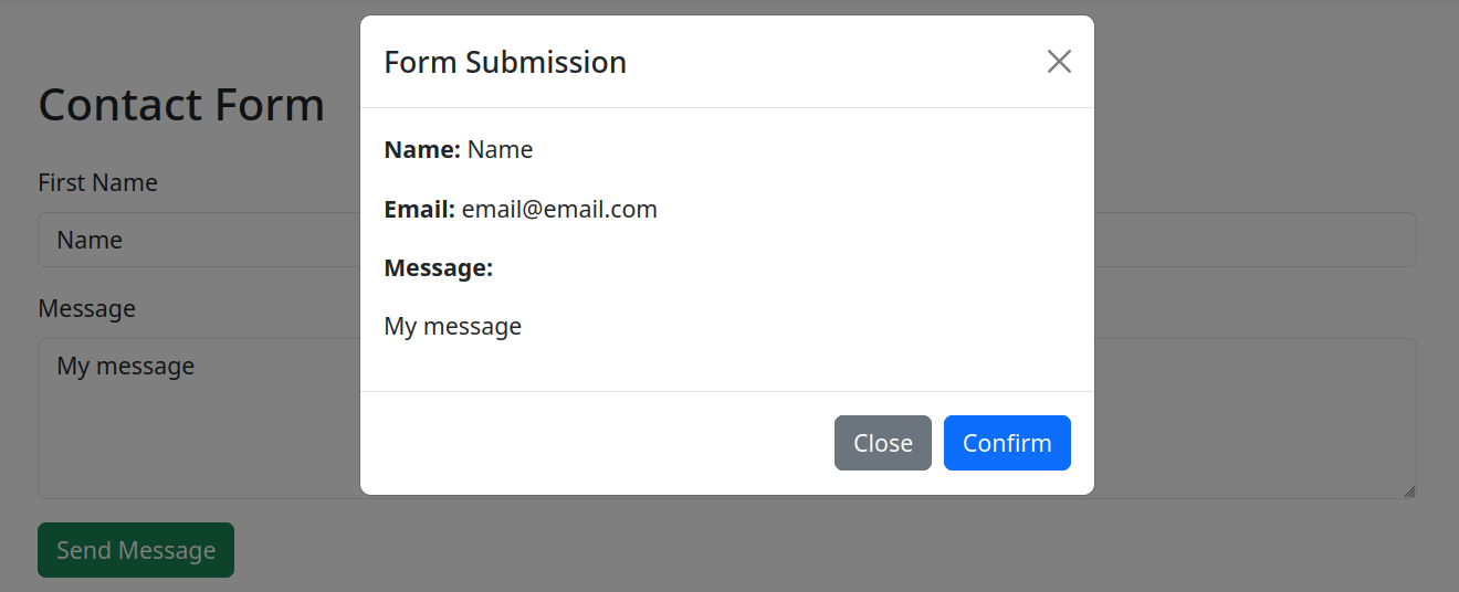
      {/* Modal */}
<div
    className="modal fade"
    id="messageModal"
    tabIndex="-1"
>
    <div className="modal-dialog">
        <div className="modal-content">

            <div className="modal-header">
                <h5 className="modal-title">
                Form Submission
                </h5>

                <button
                type="button"
                className="btn-close"
                data-bs-dismiss="modal"
                ></button>
            </div>

            <div className="modal-body">
                <p>
                <strong>Name:</strong>{" "}
                {formData.firstName}
                </p>

                <p>
                <strong>Email:</strong>{" "}
                {formData.email}
                </p>

                <p>
                <strong>Message:</strong>
                </p>

                <p>{formData.message}</p>
            </div>

            <div className="modal-footer">
                <button
                type="button"
                className="btn btn-secondary"
                data-bs-dismiss="modal"
                >
                Close
                </button>

                <button
                type="button"
                className="btn btn-primary"
                data-bs-dismiss="modal"
                >
                Confirm
                </button>
            </div>
        </div>
    </div>
</div>